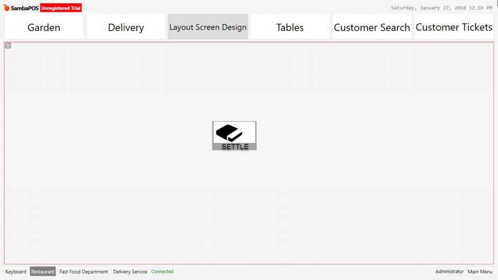
2.3.2.d. How to Add Layout Entity Screens?
Subject: Designing and customization of windows after entity screen’s view mode configured as “Layout”.
Subject Titles
Layout Design and Widget General Description
1- Ticket Lister
2- Ticket Explorer
3- Task Editor
4- Label Widget
5- Custom Keyboard
6- Html Viewer
7- Editor Widget
8- Entity Search
9- Entity Grid
10- Entity Button
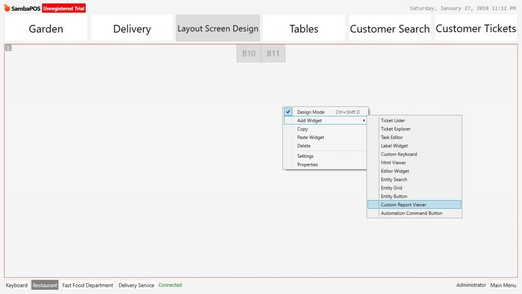
11- Custom Report Viewer
12- Automation Command Button
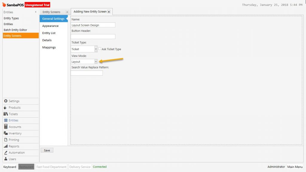
1- Entity Screen Management Setting and Descriptions
Management > Entities > Entity Screens
General Settings: The field that visual settings on user interface of entity screen is configured.
Name: Write the name of entity screen.
Button Header: Entity screen name could be displayed with a different header.
Ticket Type: Select the ticket type which will be used by created entity screen.
Appearance Section: On the Entity screens for the features that will be used on automatic settings there is no need to make any change.
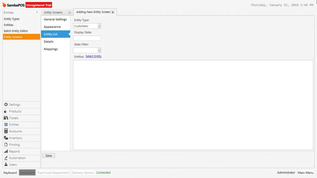
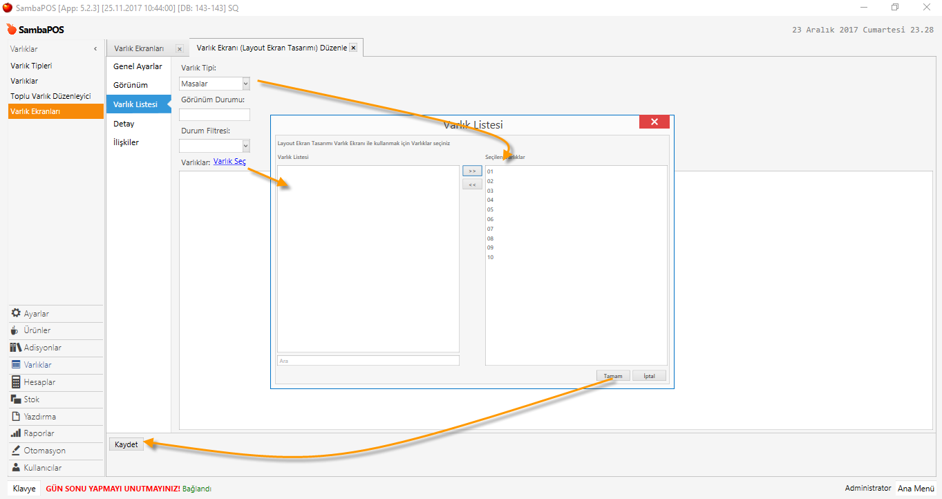
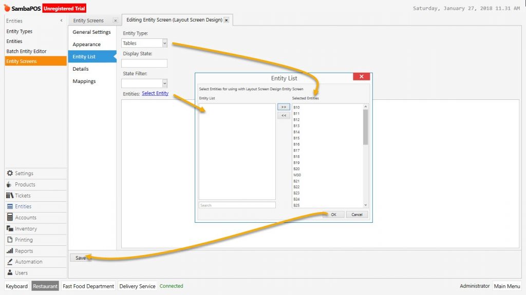
Entity List: Add from here if there is a specific entity type and entity list which will be used on screen.
Entity Type: View Mode
State Filter:
Select Entity: Select the entities which will be used on entity screen.
Detail:
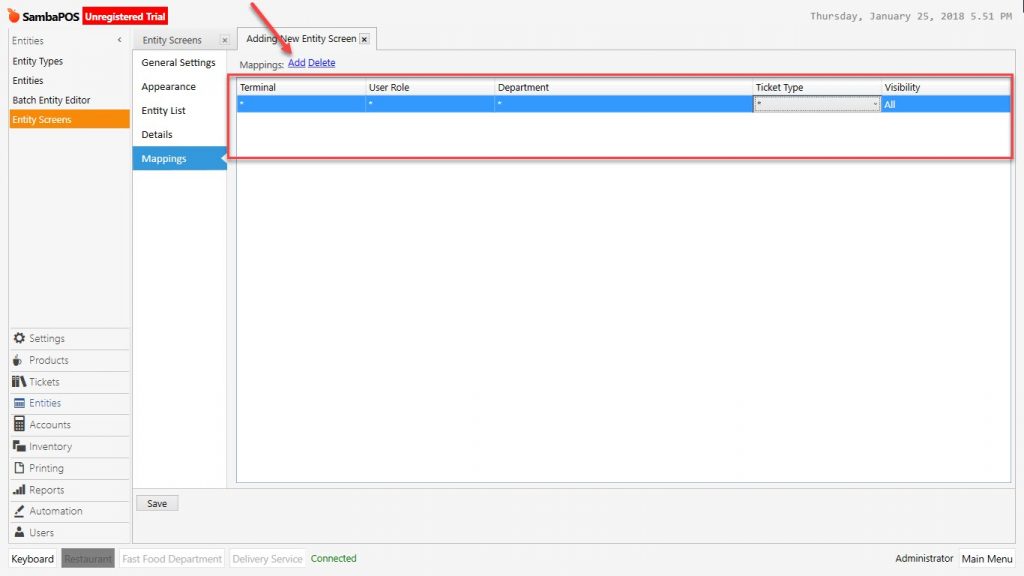
Mappings: Configure the authorization and customization about entity screen from here.
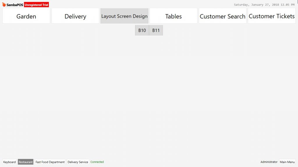
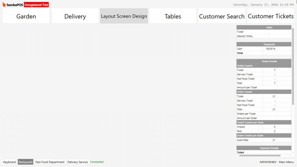
2- Entity Screens Layout Settings, Features and Design
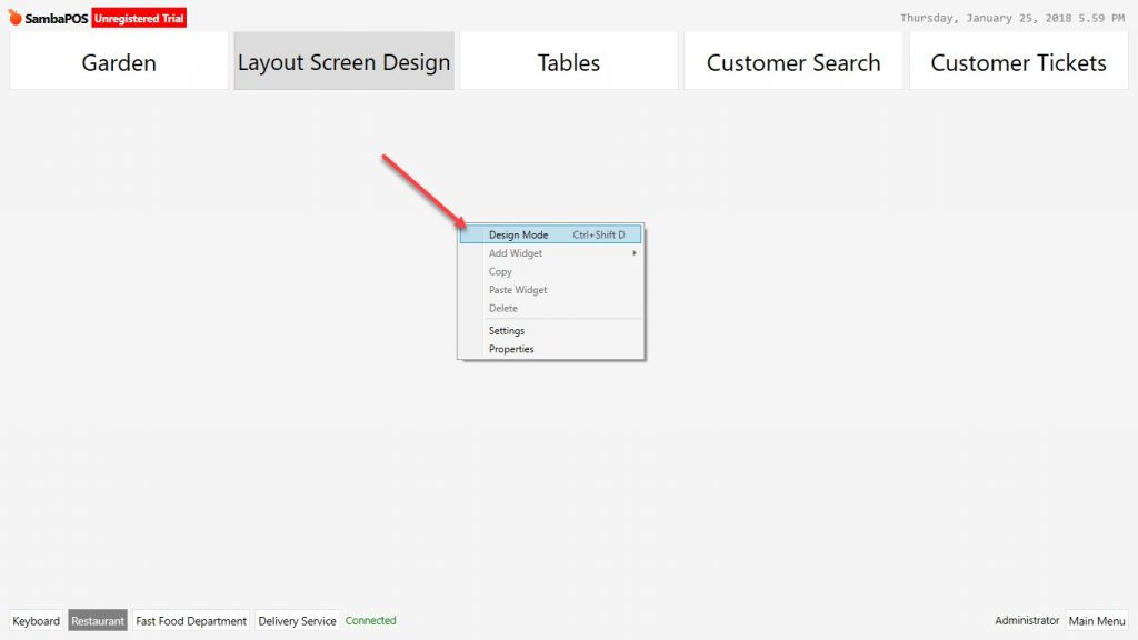
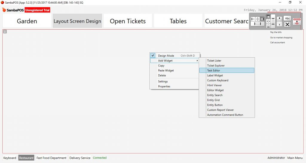
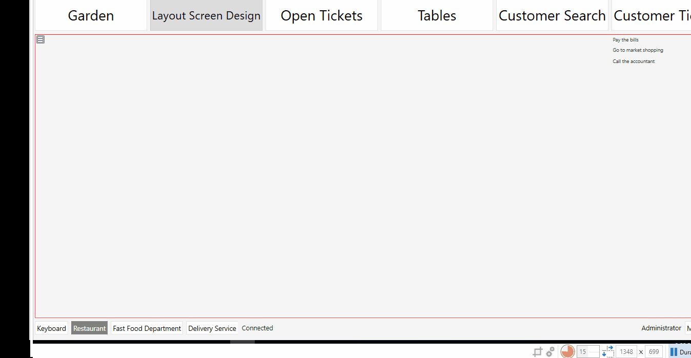
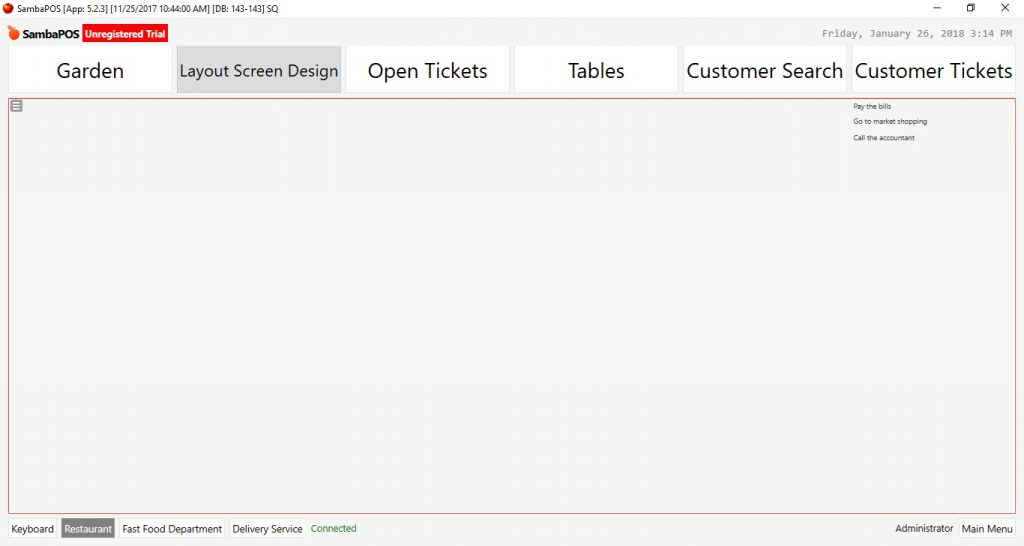
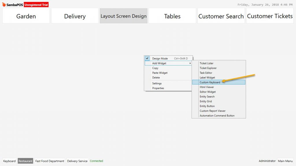
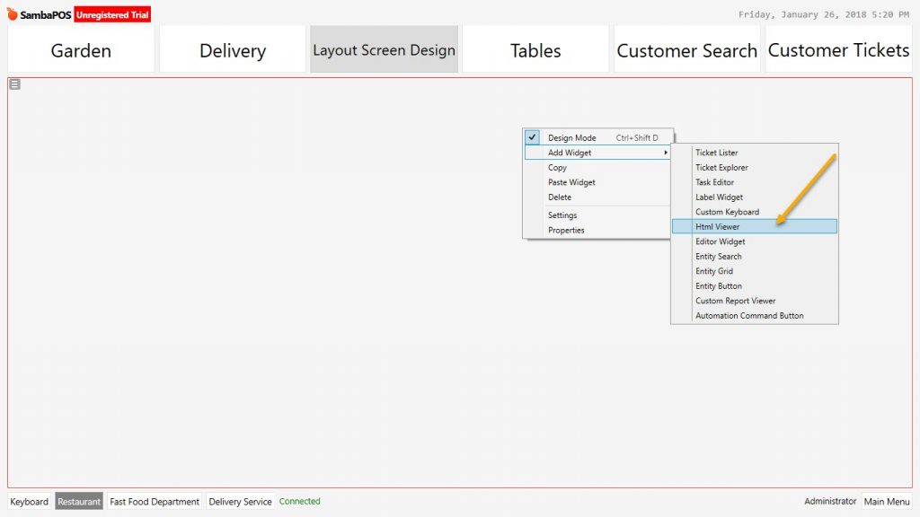
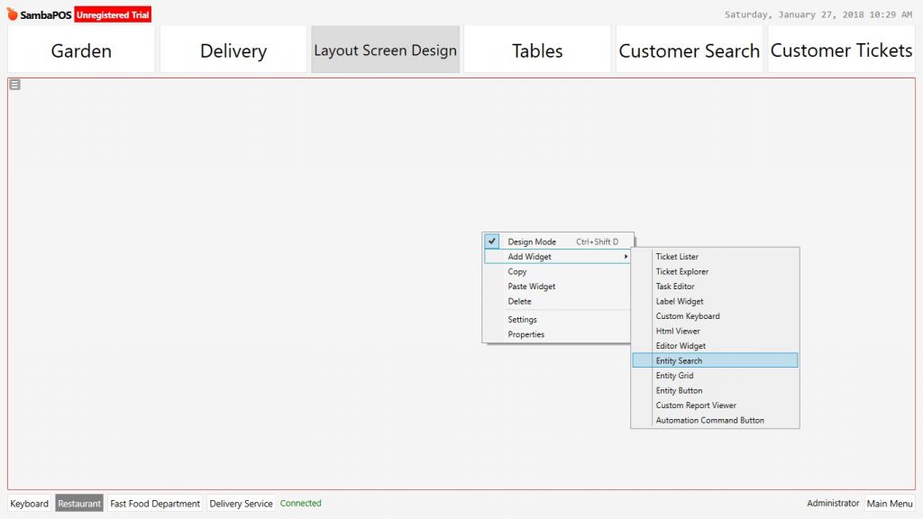
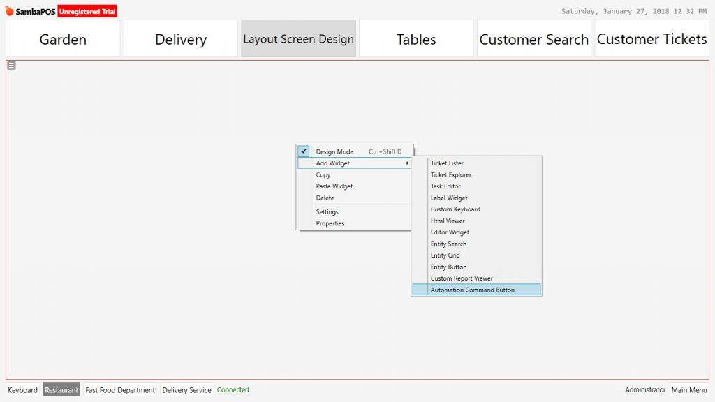
To activate design mode, right click of mouse and in the menu select design mode.
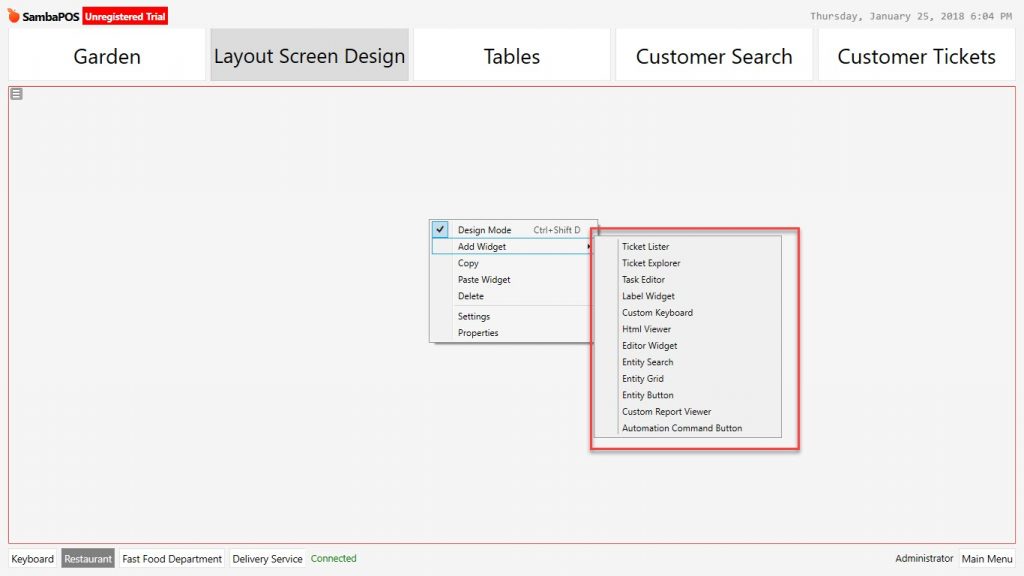
In the design mode under the Add Widget option there are 12 pieces of widget titles. Each of these titles consist of different functions and features.
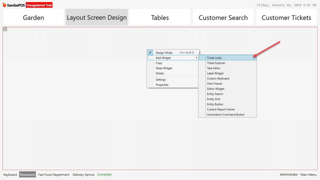
1- Ticket Lister
It is used for ticket listing by customizing their view. In order to customize ticket lists information, status and design settings are used.
Design Mode Activation:
Ticket Lister Widget Settings Screen:
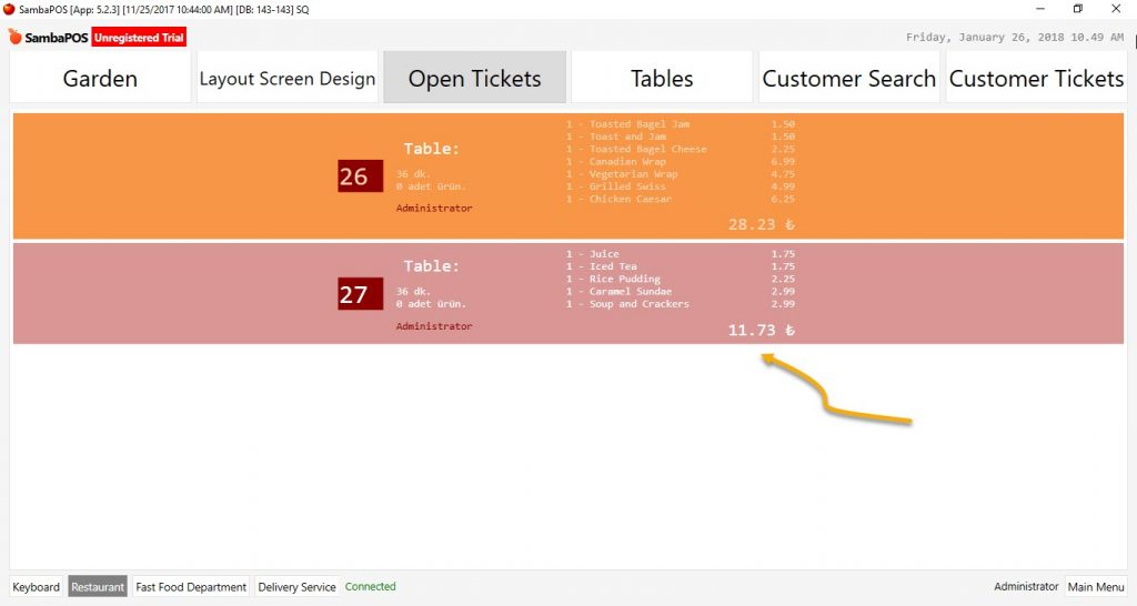
Sample Ticket Lister Widget Screen
1.1. Ticket Lister Widget Settings Titles:
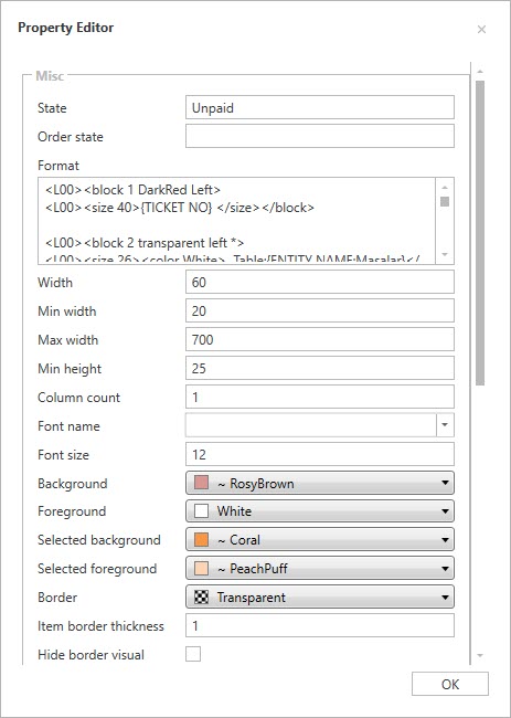
Ticket Lister Settings:
State
Order State
Format
Width
Min Width
Max Width
Min Height
Column Count
Font Name
Font Size
Backround
Foreground
Selected Backround
Selected Foreground
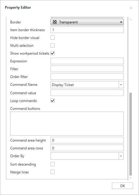
Border
Item Border Thickness
Hide Border Visual
Multi Selection
Show Workperiod Tickets
Expression
Filter
Order Filter
Command Name
Command Value
Loop Commands
Command Buttons
Command Area Height
Command Area Rows
Order By
Sort Descending
Merge Lines
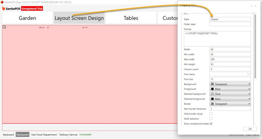
1.2. Ticket Lister Properties:
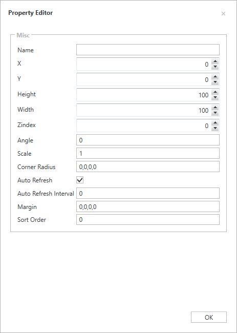
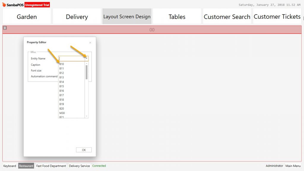
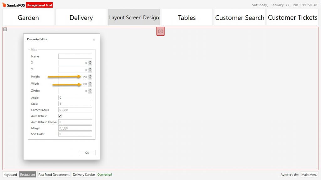
Property Editor
Name:
X:
Y:
Height
Width
Zindex
Angle:
Scale:
Corner Radius
Auto Refresh
Auto Refresh Interval
Margin
Sort Order
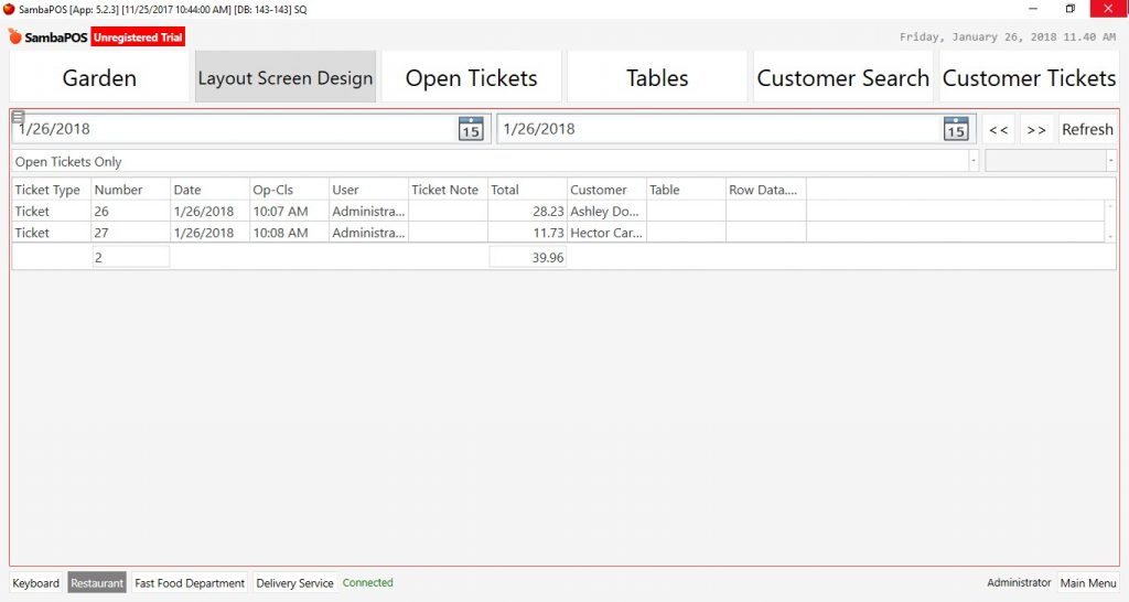
2- Ticket Explorer
Ticket Explorer screen makes possible to search and list the tickets according to criterias below.
All Tickets
Open Tickets
Document Number
Ticket Number
Ticket Note
Customer
Table
Ticket Explorer Widget can do only screen positioning.
Sample Ticket Explorer Widget Screen:
3- Task Editor
3.1. Task Editor Settings
Manage > Settings > Task Types > Add New Task Type
Create a new task type from management section.
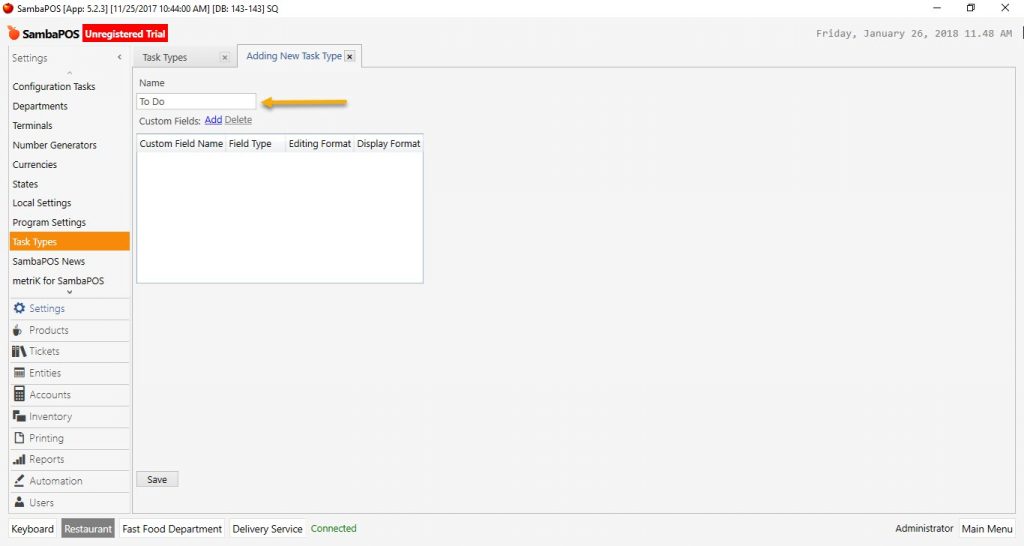
On the entity screens create a new Task Editor Widget and select a task type. Configure the settings according to need.
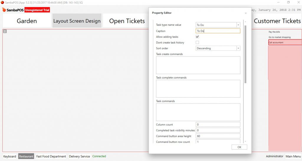
Task Editor Settings Titles:
Task Type name value:
Caption:
Allow adding tasks:
Dont create task history:
Sort order:
Task Create Commands:
Task Complete commands:
Task commands:
Column count:
Completed task visibility minutes:
Command button area height:
Command button row count:
Max display position:
Reccal size:
Custom data filter:
Content template:
Completed task format:
Custom data group by:
Default group format:
Group footer Format:
Group active items:
Display items:
Display active items
Display completed items:
Duration format:
Default format:
Default task color:
Completed task color:
Selected task color:
Border Color:
3.2. Task Editor Properties
It is used for positioning the Task Editor Widget Window on the screen.
3.3. Sample Practices:
4- Label Widget
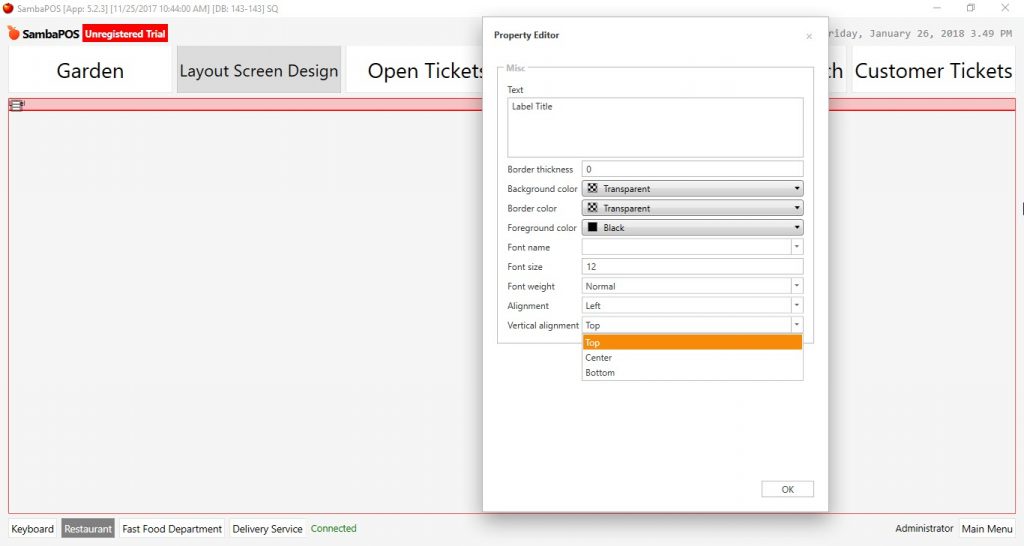
Label widget is used for creating titles of widget windows which were created on Entity Screens.
4.1. Label Widget Settings
Text
Border Thickness
Backround Color
Border Color
Foreground Color
Font Name
Font Size
Font Weight
Alignment
Vertical Alignment
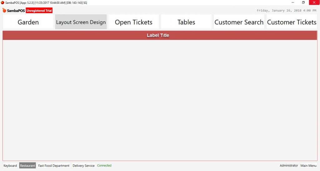
Sample Images:
5- Custom Keyboard
Custom Keyboard; It is possible to create a custom keyboard to search or enter information.
5.1. Custom Keyboard Settings
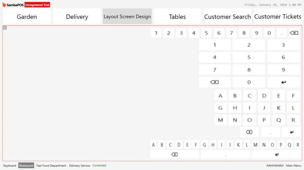
When Custom Keyboard was added first, default values come as digit from 1 to 9. From Custom Keyboard settings these values can be changed according to purpose.
Custom Keys: Write Custom Keyboard Values in here. Values are written as “Value” Columns are determined with | symbol. Below there are some sample Custom Keys.
“1”,”2″,”3″|”4″,”5″,”6″|”7″,”8″,”9″
49,50,51,52,53,54,55,56,57,48,190,8
ABCDEF|GHIJKL|MNOPQR|8,190,13
ABCDEFGHIJKLMNOPQR|8,190,13
Common and useful codes for SambaPOS Custom Keyboard;
SYM DEC Desc
, 44 Comma (or use 188)
. 46 Period, dot or full stop (or use 190)
0 48 Zero
1 49 One
2 50 Two
3 51 Three
4 52 Four
5 53 Five
6 54 Six
7 55 Seven
8 56 Eight
9 57 Nine
: 58 Colon
; 59 Semicolon
* 42 Asterisk
/ 47 Slash or divide (or use 191)
+ 43 Plus
- 45 Hyphen
# 35 Number
$ 36 Dollar
% 37 Percent
@ 64 At symbol
ESC 27 Escape
127 Delete
BS 8 Back Space
HT 9 Horizontal Tab
LF 10 Line Feed
VT 11 Vertical Tab
FF 12 Form Feed
CR 13 Carriage Return
32 Space
A 65 Uppercase A
B 66 Uppercase B
C 67 Uppercase C
D 68 Uppercase D
E 69 Uppercase E
F 70 Uppercase F
G 71 Uppercase G
H 72 Uppercase H
I 73 Uppercase I
J 74 Uppercase J
K 75 Uppercase K
L 76 Uppercase L
M 77 Uppercase M
N 78 Uppercase N
O 79 Uppercase O
P 80 Uppercase P
Q 81 Uppercase Q
R 82 Uppercase R
S 83 Uppercase S
T 84 Uppercase T
U 85 Uppercase U
V 86 Uppercase V
W 87 Uppercase W
X 88 Uppercase X
Y 89 Uppercase Y
Z 90 Uppercase Z
a 97 Lowercase a
b 98 Lowercase b
c 99 Lowercase c
d 100 Lowercase d
e 101 Lowercase e
f 102 Lowercase f
g 103 Lowercase g
h 104 Lowercase h
i 105 Lowercase i
j 106 Lowercase j
k 107 Lowercase k
l 108 Lowercase l
m 109 Lowercase m
n 110 Lowercase n
o 111 Lowercase o
p 112 Lowercase p
q 113 Lowercase q
r 114 Lowercase r
s 115 Lowercase s
t 116 Lowercase t
u 117 Lowercase u
v 118 Lowercase v
w 119 Lowercase w
x 120 Lowercase x
y 121 Lowercase y
z 122 Lowercase z
5.2. Custom Keyboard Properties
According to Entity Screen status, it can be positioned by drag and drop.
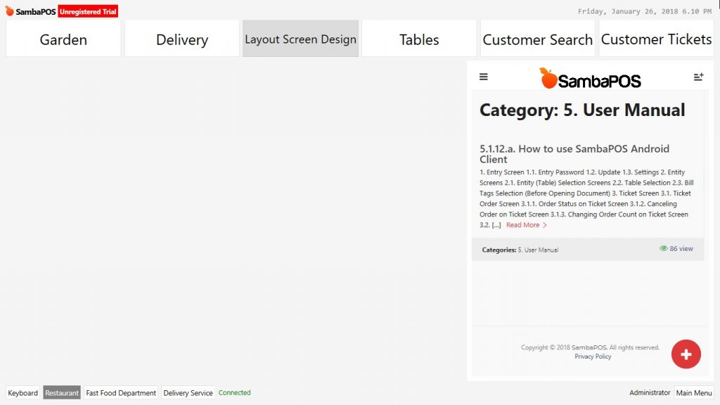
6- Html Viewer
Html Wiever Widget: It allows to use Internet Explorer Browser on the Entity Screen. It makes possible to use websites without leaving the SambaPOS Entity Screen.
6.1. Html Viewer Settings:
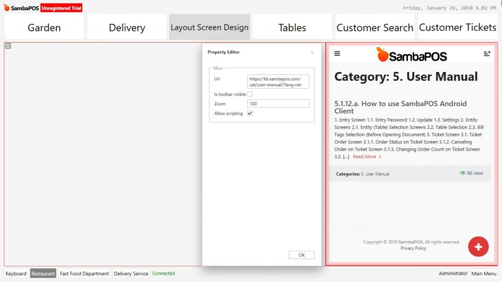
Html Viewer Widget Sample View
7- Editor Widget
7.1 Editor Widget Settings
7.2 Sample Practice
8- Entity Search
8.1. Entity Search Settings
Entity Search Widget
Entity Search Name Value
State Filter Name Value
Is Keyboard Visible
Can Edit Entity
Can Create Entity
Can Creat Account
Search Label
Command Buttons
Command Area Height
Command Area Rows
Automation Command
Command Value
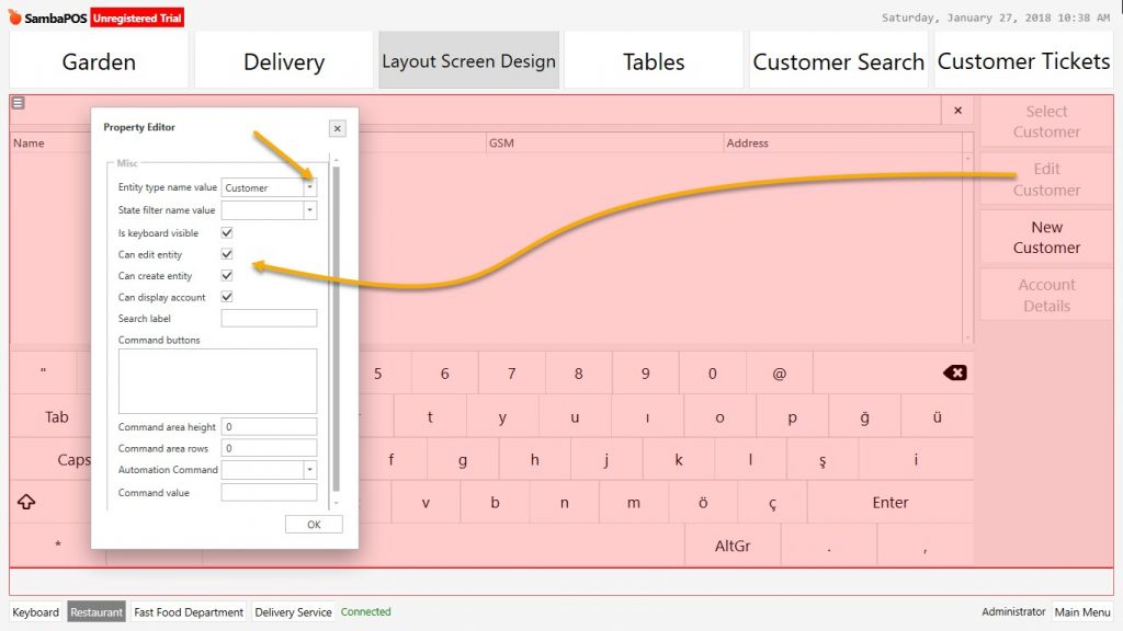
Entity Search Widget: Sample Screen View
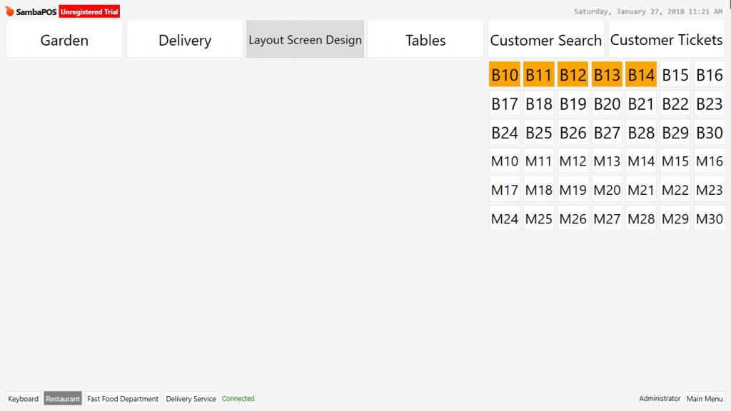
9- Entity Grid
Entity Grid Widget Window; It creates window on the Entity Screen to view entity types.
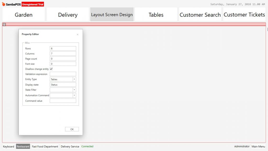
9.1. Entity Grid Settings
Widget Settings Titles
Rows
Columns
Page Count
Font Size
Disallow Change Entity
Validation Expression
Entity Type
Display State
State Filter:
Automation Command:
Command Value
Entity Grid Widget Window can be placed to a convinient area by positioning tool.
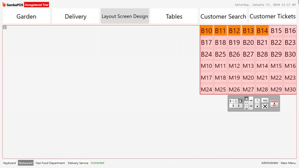
Entity Grid Widget Window Sample View
10- Entity Button
10.1. Entity Button Widget Settings
Manage > Entity List > Select Entity from here select the entities to use on the entity screen.
Add the entity buttons that need to be seen on the screen one by one.
Select the each added entity button from settings and write their titles.
10.1. Entity Button Widget Properties
Configure size and screen locations from Entity Button Properties.
Entity Button Widget Sample View
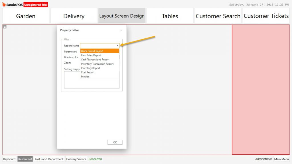
11- Custom Report Viewer
11.1. Custom Report Viewer Settings
Add Custom Report Viewer Widget on the screen..
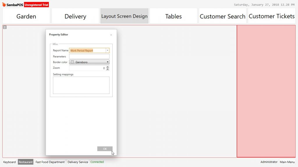
Custom Report Viewer Widget Sample View
12- Automation Command Button
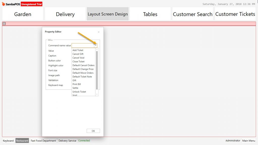
12.1. Automation Command Button Widget Settings
Add Automation Command Button Widget on the screen.
Command Name Value
Value
Caption
Button Color
Highlight Color
Font Size
Image Path
Validation
Keyboard Map
Automation Command Button Widget Sample Practice
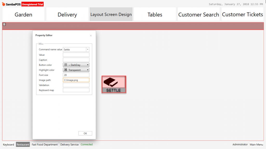
Automation Command Button Widget Window Sample Screen View